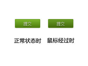
描述:只需要复制代码,一个漂亮的“提交"按钮便可以产生!
兼容浏览器:IE6-9/Firefox/Google Chrome


HTML代码如下:
<input type="button" class="sub_btn" value="提交"/>
CSS代码如下:
.sub_btn {
        width:86px;height:30px;  //需要说明的是,这里指定宽高的话,才会兼容,否则IE6和IE7就会变形
        display: inline-block;
        zoom: 1; /* zoom and *display = ie7 hack for display:inline-block */
        *display: inline;
        vertical-align: baseline;
        margin: 0 2px;
        outline: none;
        cursor: pointer;
        text-align: center;
        font: 14px/100% Arial, Helvetica, sans-serif;
        padding: .5em 2em .55em;
        text-shadow: 0 1px 1px rgba(0,0,0,.6);
        -webkit-border-radius: 3px;
        -moz-border-radius: 3px;
        border-radius: 3px;
        -webkit-box-shadow: 0 1px 2px rgba(0,0,0,.2);
        -moz-box-shadow: 0 1px 2px rgba(0,0,0,.2);
        box-shadow: 0 1px 2px rgba(0,0,0,.2);
        color: #e8f0de;
        border: solid 1px #538312;
        background: #64991e;
        background: -webkit-gradient(linear, left top, left bottom, from(#7db72f), to(#4e7d0e));
        background: -moz-linear-gradient(top,  #7db72f,  #4e7d0e);
        filter:  progid:DXImageTransform.Microsoft.gradient(startColorstr='#7db72f', endColorstr='#4e7d0e');
}
.sub_btn:hover {
        background: #538018;
        background: -webkit-gradient(linear, left top, left bottom, from(#6b9d28), to(#436b0c));
        background: -moz-linear-gradient(top,  #6b9d28,  #436b0c);
        filter:  progid:DXImageTransform.Microsoft.gradient(startColorstr='#6b9d28', endColorstr='#436b0c');
}