一、介绍
描述:这是一款很生动的CSS动态按钮,不用JS,非常棒!默认是一个静态的垃圾桶,鼠标移上去,这个垃圾桶的盖子就会掀起来,非常生动!
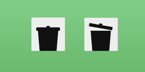
二、使用教程
HTML代码如下:
<div class="icon">
	<div class="lid"></div><!--垃圾桶顶-->
	<div class="lidcap"></div><!--垃圾桶盖-->
	<div class="bin"></div><!--垃圾桶-->
</div>
CSS代码:
body {
	/* thanks to @xposedbones for that snip! */
	-webkit-backface-visibility: hidden;  /*隐藏被旋转的 div 元素的背面*/

}

.icon {
	background: #eeeeee;
	position: relative;
	width: 140px;
	height: 140px;
	margin: 50px auto 0;
	border-radius: 3.5px;/*向 div 元素添加圆角边框*/
	transition: box-shadow .2s ease;  /*把鼠标指针放到 div 元素上的过滤效果  transition: property duration timing-function delay;*/
}
.icon:hover {

}

.icon:hover .lid, .icon:hover .lidcap {  /*鼠标移到 垃圾桶顶 垃圾桶盖 的过滤效果 */
	transform: rotate(10deg);  /*顺时针旋转 div 元素*/
	margin-bottom: 10.5px; /*旋转后向上提升10.5像素*/
}

.lidcap, .lid, .bin {
	position: absolute;
}

.lidcap, .lid {  /*垃圾桶顶 和 垃圾桶盖 */
	border-top-left-radius: 2.8px; /*圆角*/
	border-top-right-radius: 2.8px;  /*圆角*/
	background: #111111;  /*颜色*/
	transition: transform .2s linear, margin .2s linear;  /*过滤效果*/
}

.lidcap {  /*构建垃圾筒顶*/
	bottom: 96.6px;
	left: 63.0px;
	height: 7px;
	width: 14px;
}

.lid {   /*构建垃圾筒盖*/
	bottom: 84px;
	left: 21px;
	width: 98px;
	height: 14px;
}

.bin {  /*构建垃圾筒*/
	bottom: 0;
	left: 28px;
	width: 70px;
	border-top: 84px solid #111111;
	border-left: 7px solid transparent;
	border-right: 7px solid transparent;
}