一:简要描述
题记:一直以来,这个做法是最好用的。但每次做的时候,都忘,于是每次就是百度进行搜索。今天,我想还是把它总结下来吧,对于这种常用的东西的,就应该总结为一种模块,以来常拿来用。

二:相关原理
方法:“隐藏容器溢出”和“正内补丁”和“负外补丁”结合的方法。这是一种比较另类的方法,在IE6、IE7、FF3下测试通过。要点:
1、父DIV设置overflow:hidden;
2、对要高度自适应的DIV设置 padding-bottom:100000px;margin-bottom:-100000px,然后有一个布局只要有一个高度就可以了!
注:两列布局或多列布局同理。
三:代码
代码下载: http://git.oschina.net/hongweizhiyuan/heightauto.git
1、两列布局代码如下:
代码预览: http://www.ijquery.cn/study/demoqianduan/heightauto/demo1.html
<html>
	<head>
		<meta http-equiv="Content-Type" content="text/html; charset=utf8" />
		<title>Div高度自适应-两栏</title>
		<link href="//cdn.bootcss.com/normalize/3.0.3/normalize.css" rel="stylesheet">
		<style type="text/css">
			#wrap {overflow: hidden;}
			#sidebar_left,##sidebar_right {padding-bottom: 100000px;margin-bottom: -100000px;}
		</style>
	</head>

	<body>
		<div id="wrap" style="width:100%;">
			<div id="sidebar_left" style="float:left;width:40%; background:#FF0000;height:800px;">居左</div>
			<div id="sidebar_right" style="float:right;width:60%; background:#0000FF;">居右</div>
		</div>
	</body>

</html>
图示:

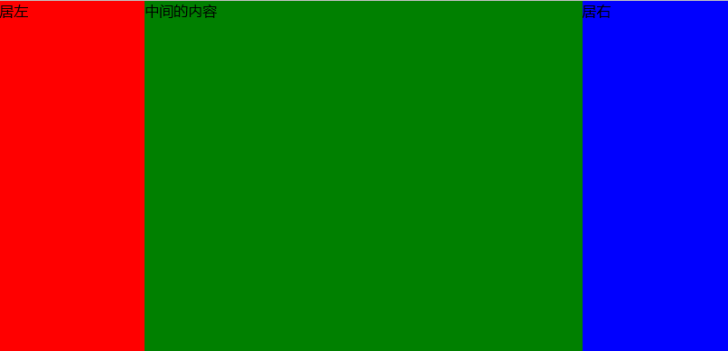
2、三列布局代码如下:
代码预览: http://www.ijquery.cn/study/demoqianduan/heightauto/demo2.html
<html>
	<head>
		<meta http-equiv="Content-Type" content="text/html; charset=utf8" />
		<title>Div高度自适应-三栏</title>
		<link href="//cdn.bootcss.com/normalize/3.0.3/normalize.css" rel="stylesheet">
		<style type="text/css">
			#wrap {overflow: hidden;}
			#sidebar_left,#sidebar_mid,#sidebar_right {padding-bottom: 100000px;margin-bottom: -100000px;}
		</style>
	</head>

	<body>
		<div id="wrap" style="width:100%;">
			<div id="sidebar_left" style="float:left;width:20%; background:#FF0000;height:800px;">居左</div>
			<div id="sidebar_mid" style="float:left;width:60%; background:#008000;">
				中间的内容
			</div>
			<div id="sidebar_right" style="float:right;width:20%; background:#0000FF;">居右</div>
		</div>
	</body>

</html>
图示: